Showing posts with label camouflage. Show all posts

Thursday, 8 June 2017

Zvezda 1/100 Tiger I - Part 2


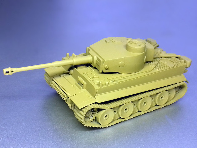
Before I got down to priming the model I decided to have a go at drilling out the model's muzzle break as that feature (or rather lack of feature) is the one major gripe I have with this kit. The tracks are a bit oversimplified as well, but I can live with them as this is pretty standard for Zvezda.

Anyway, muzzle improvement done, I primed the Tiger with Flames of War's 'Panther Yellow'...


I was really pleased with how this primer goes on, for a rattle can it lays down quite a thin and smooth coat. That said, i'll be glad when I have an airbrush again as it's a lot more cost effective than the Flames of War spray can at £7.50 a pop.

Tiger Stripes?
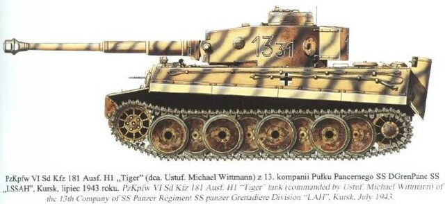
OK, now what camo scheme? Since this Tiger is intended for my planned 'Battle of Kursk' GF9 TANKS game, it won't be one of the more familiar post-D-Day 3-colour patterns (or popular 'Ambush' pattern). I want a pattern that's specifically not D-Day-ish.

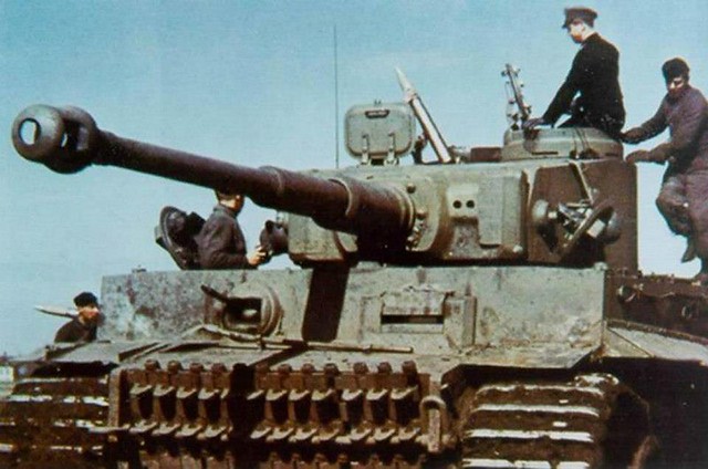
Something like this...


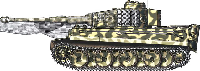
And NOT because it's Michael Wittmann's tank, by the way! I just fancy a simpler 'tiger stripe' pattern...Because, it's a tiger! (I won't go as far as making it black and orange though.) Here's another example of green 'stripes'...


The only issue, if you can call it that, is that I will be using a brush to apply these stripes, whereas it would normally be tempting to reach for an airbrush for these stripes. However, the second example I have (above) looks like it is hard-edged, so a brush should be perfectly fine.

Finally, my choice of green will be Vallejo's German Cam. Dark Green [979].

Keeping Track
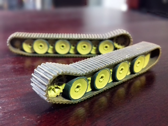
I'd like to get the tracks out the way before I launch into the hull painting. With this Tiger - as it is for a 'Russian Front' game - I want to produce a similar reddish coloured mud effect that I did for my recent 'Ferdinand' (which is for the same game). I may be wrong but I equate the eastern front with a redder mud, I admit this may just be my false impression (as I guess mud is mud really).

I used Vallejo pigments for my Ferdinand's tracks but I am trying something different this time and I'm following a tutorial from the Flames of War website called: 'Changing A Tiger's Stripes'.

Not the tidiest job - those road wheel edges were a nightmare - but it should
all smooth out once I apply a wash. I'm still not sure about starting with a
brown base for tracks, but let's see how it turns out.
The Zvezda tracks are very simple 'slats' and this is where - as mentioned previously - where Battlefront's (and possibly the 15mm models of the Plastic Soldier Company) have the advantage in the level of detail. How much this will mean if you are primarily a gamer and not a modeller is something each buyer will have to decide for themselves...I had my gamer hat on when I bought this.

The Tiger Onesie!
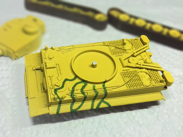
Back to camouflage now and the striped scheme should be, technically, a pretty simple pattern to reproduce. I'm not a confident freehand painter but in this case sketching out the pattern lightly using a pencil seems a little unnecessary, so I'm jumping straight in with a slightly random pattern...


Next: Hopefully this Tiger will have all its stripes and I can move on to the decals!

Sunday, 21 May 2017

Battlefront 15mm Panther and Jagdpanther


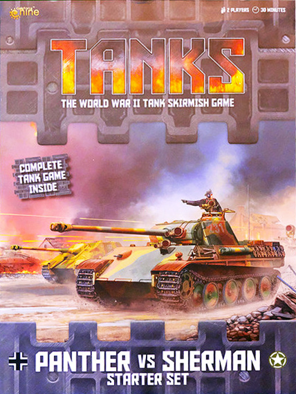
This is the final part of my 'GF9 Tanks Starter Set (Panther Vs Sherman)' series and comprises of the production of the German opposition in the game, the Panzer V Panther. However, as I mentioned in an earlier post about this game set (link to post here), there is an option to mount the Jagdpanther upper hull on the Panther chassis to get two tanks for one (with some sneaky use of mini-magnets)!

The 1/100 Battlefront Panther and Jagdpanther kits are rather nice - if somewhat 'chunky'* and simplified - models. But, they are - in my opinion - on the higher quality end of the wargaming quality kit spectrum. They have packed a good deal of nice surface detail into these little kits and have some very nice track detail.

* I have noted on several occasions, when talking about these sort of 'wargaming quality' kits that they can be a little 'chunky' and sometimes over-scaled (Plastic Soldier Company models are a prime example). Well, I've come to understand that is sort of deliberate to make the models a little more durable as playing pieces. Zvezda scales their 1/100 models more accurately, but - as I found out with their M3A1 Stuart kit - this means details like guns become very fine and therefore possibly prone to breakage. This over-scaling is sometimes referred to as 'Heroic' scaling.

Anyway, back to the job in hand. Having mad up my Panther/JP model for playing purposes (unpainted) it's now time for my GF9 panzers to follow the example of their Sherman opponents and get a lick of paint!

Choosing a Panther Camo Scheme
As I found with my 1/100 'Elefant', the choice of German WW2 is wide and wonderful, and this is particularly true of the later war panzer schemes. Starting from D-Day the variety of camouflage patterns seemed to snowball from the fairly standard - but still variable - 'three colour pattern' to - by 1945 - and almost anything goes 'let's just get the tank on the battlefield' (sometimes not painted at all) attitude!

So, I decided that the best place to start was to pick a specific period and/or theatre. This would help me pin down a sort of historic parameter for camo choices.

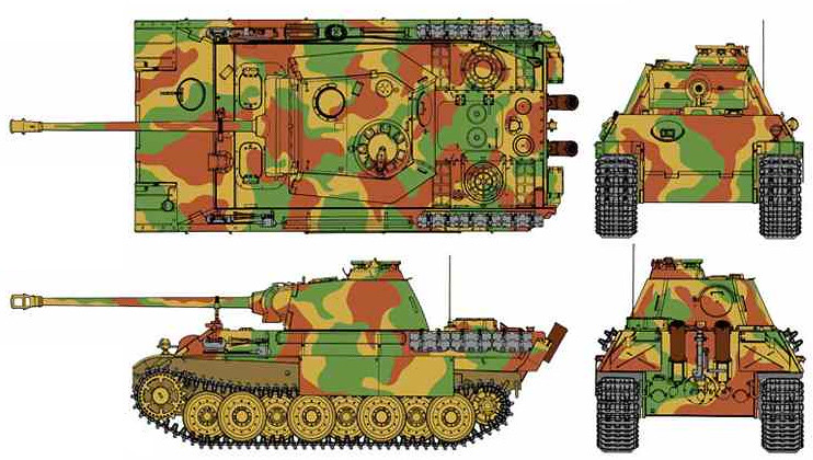
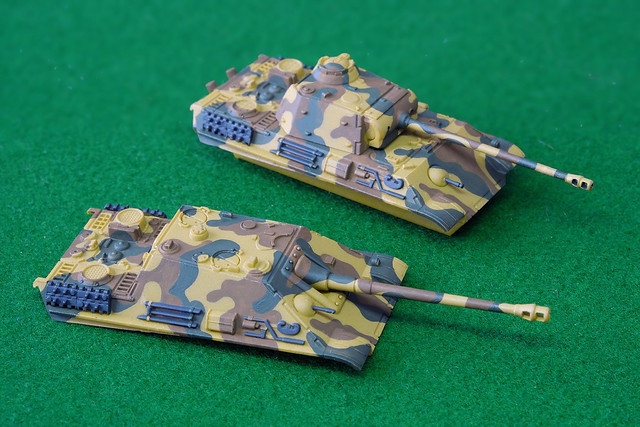
I wanted my Panther/JP to be D-Day specific - so as to be suitable opponents for my D-Day Shermans - so this ruled out a lot of the more weird and wonderful 'late war' Panther schemes. I eventually came across a 1944 3-colour paint pattern that I liked (I sort of prefer large, harder-edged patterns)...


I will be using this same pattern for both the standard Panther upper hull and that of the optional Jagdpanther hull.

Hairy Stick Time
As I am still without an airbrush at the moment, it's another chance to practice my brush skills (another reason to go for a 'hard-edged' camp pattern). I began by priming the Panther hulls with Flames of War's 'Panther Yellow' and then I worked on the brown patches of camo using Vallejo Model Color 'German Cam. Med. Brown' [826]...

My LED desk lamp made these a little over saturated, the colours are actually
a little more muted than this.
I tried to follow - roughly - the same shapes on both hulls so that they would neatly join up with the pattern painted on the lower hull. One thing I like about painting patterns using a brush is that if I vary the dilution of the acrylic with water you get a semi-opaque - almost 'watercolour' - effect where the paint is not uniform and 'flat'. This can add to the impression that the camo was added over the Dunklegelb base colour in the field and also that it was 'faded' in places (that's my excuse).

Next I start to add the green 'blotches' using Vallejo's Model Color 'German Cam. Dark Green' [979]. Now, I know there is some amount of debate as to whether these two colours are true to the original German paint colours (the brown doesn't seem to be red enough and the green not green enough, allegedly) but I want a more muted effect...

Lighting was a bit dark here, but hopefully, you get the idea.
Emblems/Decals
Doing an 'authentic' scheme for Battlefront's 1/100 game tanks models is a bit of a 'DIY' process. Unlike 'display' kits these little models don't come with decals or a 'suggested scheme', so you are left to your own devices as to how you paint and decorate them.

Also, authenticity isn't, perhaps, the absolute priority here as these models are playing pieces, so there's an accepted leeway for 'artistic licence'. Basically, nobody will pull you up if your chosen camo scheme wasn't entirely correct for this or that theatre or period or unit, so long as the spirit of the national faction is adhered to for the game. Players of this game don't tend to be rivet counters or pedants (IMHO).

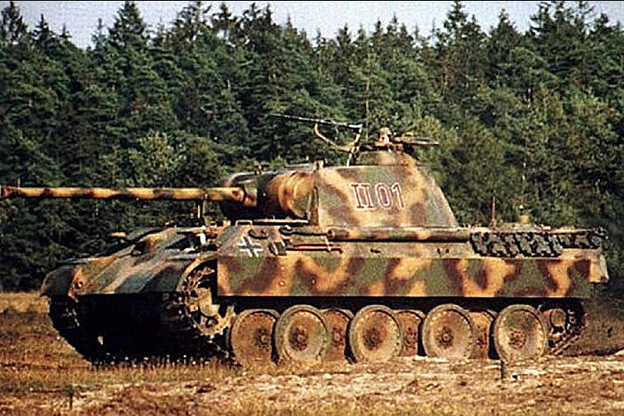
Here's an example of Panther numbering and emblem format that
I quite like. The plain white numbering suits my intention to use
dry transfer lettering as I have similar font/styles.
So, with this in mind, my camo scheme for the Panther/JP was a 'generalisation' and that's how my decoration will be as well. I'll be keeping it simple, with just a couple of German crosses and a made-up vehicle number...This model is NOT based on any actual identifiable historic tank or unit!

I'm using Woodland Scenics dry transfer numbers for the Panther and the decals for my Jagdpanther are from the Skyrex AD43 German Tank Numbers and AD28 German Crosses. I have to say, I'm not so impressed with the quality of the Skyrex decals, I think they are short run printed decals and their transfer film is quite thick so I'm having to use Microscale's Micro Sol to help settle them in nicely.

Applying one number at a time is a bit tricky as you are never completely satisfied that everything is straight and level...


And that's nearly it for the basic paint scheme and decalling. I have to go around them again to do a bit of touching up and add some metalic dry-brush effects to the bare steel part and then the everything will be real for a coat of satin varnish. This helps seal the decals and prepares and protects the paintwork for teh next stage, which is an overall wash.

Thursday, 11 May 2017

Zvezda 1/100 'Elefant' - Part 2

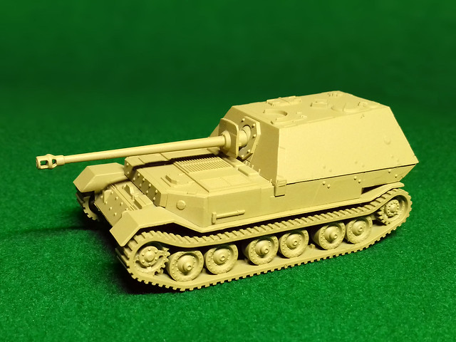
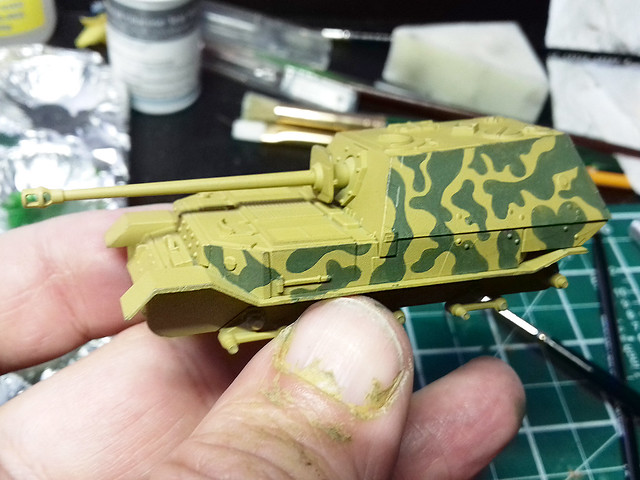
As my airbrush is out of action (I may have to buy a new one) I am back to using 'rattle cans'. I did look around for a good acrylic spray 'Dunkelgelb' - German Dark Yellow - but the only one I could find was by Flames of War in their War Paint range. Called 'Panther Yellow' it seemed to go on as well as Humbrol's excellent sprays...


Had my airbrush still been working I would have used Vallejo's excellent water-based polyurethane German Dark Yellow Primer. This has a tinge of pea-green to it, rather than the sand-yellow of the Flames of War paint...

Left: FoW's 'Panzer Yellow'. Right: Vallejo's 'German Dark Yellow'.
Choosing a Camouflage Pattern
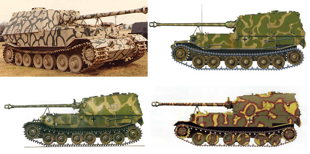
Now to the hard part, choosing a camo scheme. The Zvezda Elefant is the early model typical of the type that first saw action on the Russian Front in 1943, still, there are some very attractive patterns to chose from...


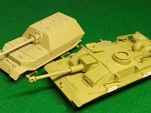
As I am keeping this model, exclusively, for games against mid-war Soviet opposition I don't mind that it won't get as much play as - say - a Panzer IV or a StuG III. It's just such an attractive model to have in my collection, and I am such a sucker for tank destroyers (I really want to build more)!

So, let's get cracking with my chosen camo type (with some poetic licence)...

As my airbrush is bust, it's back to good old brush painting. This may take
some time!
Phew...Boy, I am rusty, but it's getting there!
Track Record
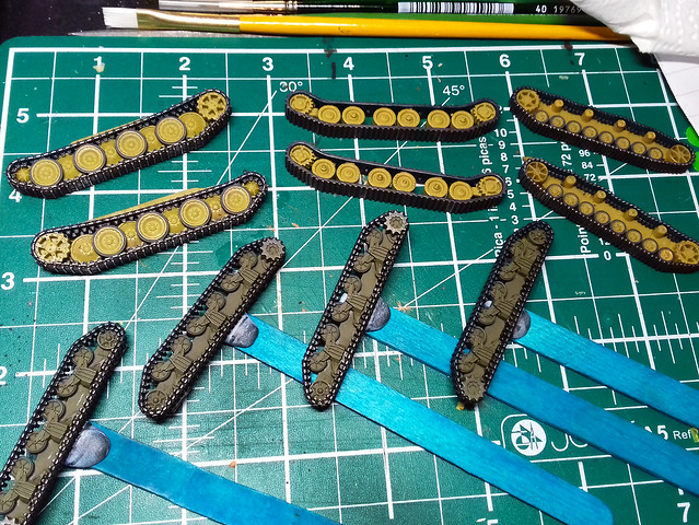
Just a little aside, because I have several of these little 15mm tank kits on the go at the same time I had the unusual sight of five sets of tracks on my small workbench at the same time!

As well as the 'Elefant' tracks - top middle - I am currently working on four
other sets; a Panther set, Panzer IV set and two sets of Sherman tracks!
After base painting these tracks a dark colour - black for the Shermans and German Grey for the panzers - I painted the outside of the roadwheels with Vallejo's Dark Rubber (except the Elefant's which seems to have all steel road wheels/rollers).

Then I gave all the tracks a rub with a graphite pencil to give the impression of bare steel. Then it's off for a light coat of gloss varnish in preparation for the application of some German insignia...

Oooops, I forgot (having learned this before) that doing the graphite pencil
work *before* glossing is a bad idea. The shiny 'steel' effect disappears
after a coat of gloss varnish! Du-oh! 

Decal Stage & 'Pre-Weathering'

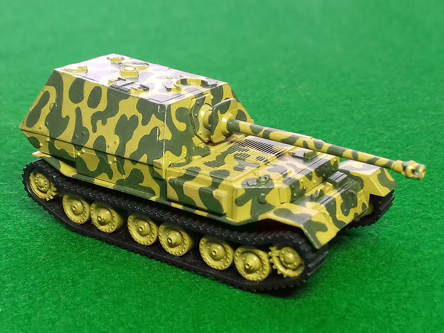
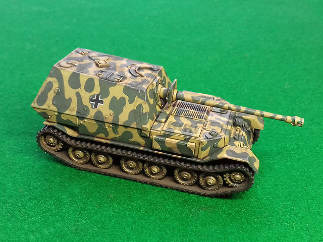
Well, there are actually that many decals to apply, just three German crosses and two sets of vehicle numbers. I don't have 1/100 scale decals to hand so I'm hoping my smallest 1/76 German decals will work (I know the crosses will be a little too large). There was some poetic licence to my application of decals and they are not historically accurate but are intended to be suitable for tabletop gaming purposes.

With the decals quickly applied I moved on to a new process that I have just started applying to my models - 'pre-weathering' prep. The idea is to lay down a thin wash of peaty brown to indicate surface dirt and to take the 'newness' off the pristine painted model prior to more intensive weathering.

An added bonus of this 'pre-weathering' wash was to modulate the basic FoW
Panzer Yellow - which I thought was a little too bright - and make it more like
what I think Dunkelgelb is supposed to be like.
I have also started to apply some 'mud' (Humbrol Dark Earth Powder) to the tracks, so it's starting to look something like a finished model, but I have still some focused weathering to apply.

I am pleased with this newly added phase in my painting and will start to use it on more of my models. In fact, I had occasionally already been experimenting with a sort of weathering prep using powder pigments, but this was very hit and miss and I was never really satisfied with it. Using a light - diluted - wash is far more effective.

Next: Deep weathering - chipping, etc.

Tuesday, 2 August 2016

Hataka trauma over!

Hobby Boss 1/72 Hawker Hurricane Mk. IIC - Part 4
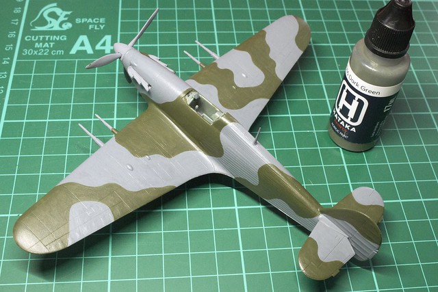
Phew! This is as much as I'm doing with Hakata paints (bored now), but I have learned a few things...


Once again, I have to thank the very helpful and friendly guys over on Facebook's 'The Plastic Scale Model Making Group' (Closed Group, you need to ask to join) with whom I've had a very lively and informative discussion about Hataka paints. The upshot of this conversation was 'it's not just me' (which is nice to know) as quite a few people have found this make of acrylic paints 'tricky' to use (and to be fair, a couple have actually mastered them).

The general consensus is that - to brush-apply Hataka acrylics - you do need to use multiple thin coats of paint. This is in line with what I have found - I made an utter mess of the 'Ocean Grey' areas of the camo scheme by trying to apply it like I would have with enamels.

What will be interesting now is how the proceeding decaling and weathering stages will affect how my shoddy brush painting looks!

Friday, 8 July 2016

Hobby Boss 1/72 Spitfire Mk. Vb - Part 3 (ish)


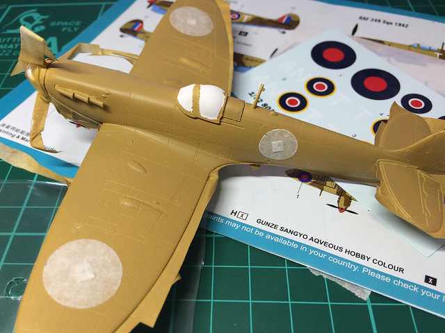
Having remedied my airbrush fiasco which is the underside of this model (finally applied the right blue), I'm on with the masking ready to begin the top-side of the fuselage. At least, this time, I am pretty darn sure I am using the correct colour - Vallejo Model Color 'Middle Stone'...


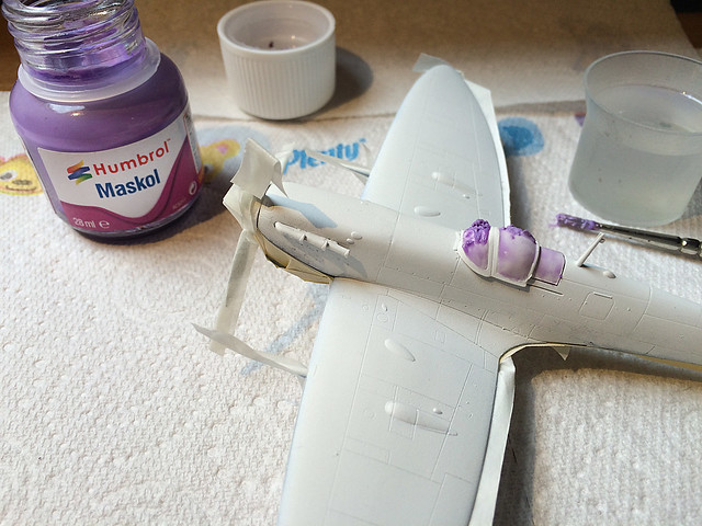
But, before I start spraying, I had to come up with a plan for masking the cockpit windscreen. I usually just use tape, but with the framework around the 'glass' needing to be painted I decided to give a liquid masking fluid a try - Humbrol's Maskol (this is a frst for me).

I have to say, it's a bit tricky to use as you have to work out the best dilution to make it flow. In it's 'neat' state Maskol is like a laytex gum (for want of a better word). Humbrol - in ther tutoral video which I will embed below - suggest that it be thinned for painting on using tap water. While this seemed to work - to an extent - I still found that it dried pretty quickly into small globules of gummy blobs. (Humbrol says it's suitable for airbrushing, but you wouldn't catch me trying it!)


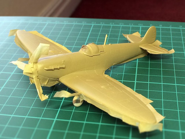
Anyway, the canopy protected I got on with applying the upper-surface base colour. It's called 'Middle Stone' and I thought it would be a sort of sandy yellow, but instead - at least with Vallejo's take on 'Middle Stone' - I got something that was very 'caramel' (or diarrhea) coloured...

It looks a bit fudged...Hahaha, sorry, couldn't resist!
Now, onto the tedious part - masking out the camo scheme!

I'll  be blanking out the roundel positions, so no painted camo pattern shows through the decals (another first for me). Whether this is absolutely necessary in this case is debatable, the reason for doing this - usually - is so any paint pattern does not show through thin decals (especially if they contain white)...

This is a better representation of what the 'Middle Stone' looks like.
Still, it's interesting to try out new things. But, anyway, on with the rest of the camo pattern masking.

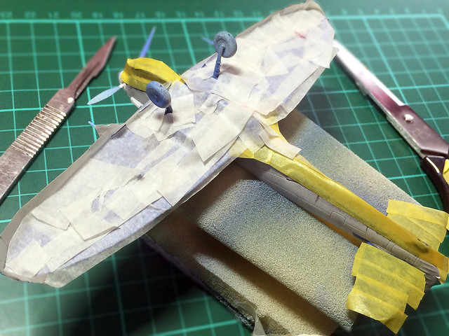
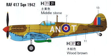
I'm using masking tape for a harder-edge pattern...


Many, more experienced, aircraft modellers go to the trouble of copy-enlarging the kit paint instructions so that they can be used as a 1:1 paint template. I will have to try this out at one point, but - again - as this is just a paint test I'm not going to go that far.


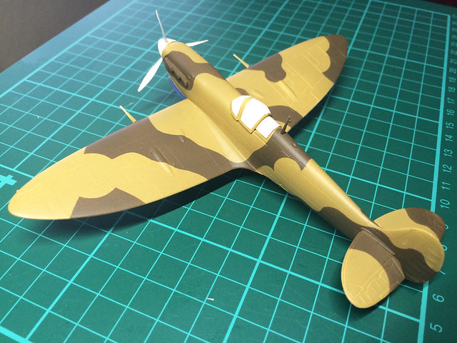
The second camo colour is 'Wood Brown' - according to the Hobby Boss instructions - and I have bought Vallejo's Model Air 'Dark Earth' [029], fingers crossed it is a good match...


Hmmm, very flat and hard-edged. Not sure I like this very hard scheme, a softer edge might have been better, which I could have done using the BluTack masking method (my airbrush is not up to fine free-hand work).

Well, that's that for now.  Next, I'll tidy up a few bits and paint the smaller parts (like the prop and the canopy) prior to glossing.

Monday, 11 April 2016

Minairons 1937 Chevrolet 1.5ton truck - part 7


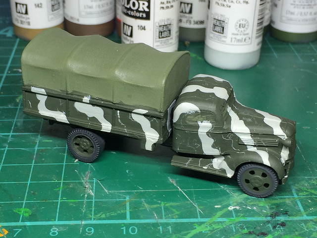
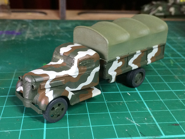
After the usual primer coat of Hycote Black Matt aerosol, I brush painted on a coat of my 'Finnish Green' (50/50 mix of Vallejo 'German Cam. Dark Green' and 'Yellow Olive').  I'm beginning to like brush painting, it's not only a lot less fuss than airbrushing, but it has a texture and variability of coverage that I think looks a little less clinical as airbrushing does. But, that's a matter of opinion.

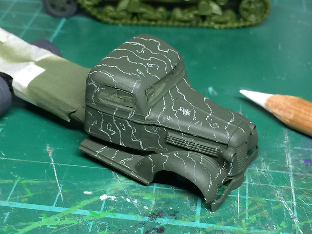
Next, I prepared for the application of my Finnish 'Beige-Grey' by marking out these patches using a white pencil...


As it turned out, my beige-grey mix was far too grey (and not enough beige). In fact, my camera's flash even made the grey look snow-white!


It looks a rather attractive winter camouflage scheme (must remember that)! But, for my purposes, the beige is a bit of a fail and will have to be rectified (replace Vallejo's 'Blue Grey' with their 'Stone Grey' paint).

Still, let's get the third colour of the Finnish camo scheme on first before I tinker with the 'beige'...


It's obviously not my day, as the dark brown came out a bit too light and red! Again, that is easily rectified with a light wash of darker brown. However, in a way, using lighter paints is a bit of a tactic I have been thinking of employing as I am finding that once I introduce weathering this darkens the base paint scheme anyway.

Well, that's the progress on the '37 Chevy. Even at this stage, it's quite a handsome looking kit, despite its simplicity.

Next: Rectifying my dodgy camo scheme, and painting the tilt canvas!

Thursday, 11 February 2016

Finnish T-50, an interesting observation

If I ever needed a reminder that I am still just a 'kitnoob', this is it! Apparently you not only have to be a keen fan of the past to model WW2 models but you also have to have the ability to see into the future as well.

As you may know, I have laboured hard to try to get what I thought was 'a' (it's all subjective) accurate 3-colour Finnish camo scheme. And just when I was fairly satisfied whit my recipe the God of Modelmaking has come along and kicked me in the ass.

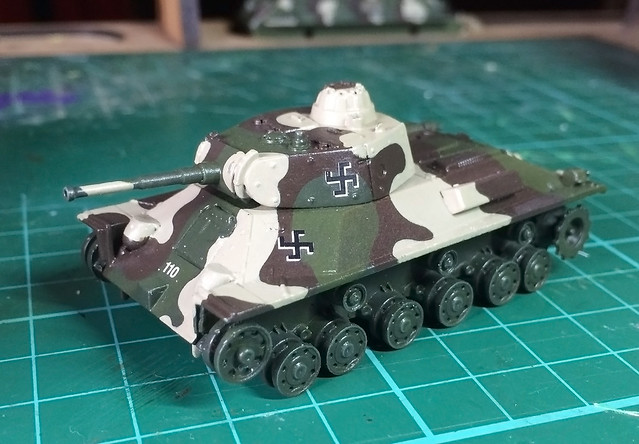
Here's a reminder of what I was happy(ish) with before weathering...


And now, after starting the weathering process with my - now usual - 'bleaching and staining' stage using oils I have this...


Now, the difference may be somewhat subtle but in effect, my T-50s scheme has been knocked back a shade and the hue slightly modified. This is particularly noticeable in the 'beige grey' colour, which in now a light tan colour. Here's another picture which may illustrate the change better...


The T-26 (left) has my original Finnish scheme in pristine colours, while the T-50 has the same colours 'modulated' through the weathering I applied.

Now experienced modellers will say, 'yeah, and...' because they will know that I should have taken this modification in colour into consideration at the base camo painting stage (perhaps by painting the scheme deliberately lighter).

Bum!

Another thing to take into consideration.

As it turns out I kinda like the new tones (well, I have to say that now don't I)! The option would be to start again if I didn't. Thinking logically, this is perhaps what would have actually happened to the real scheme in the field, when dirt and dust covered the paint and subtly changing their appearance.

Phew...There's always something new to learn.

Monday, 8 February 2016

Altaya 1/72 T-50 - Part 5

Slow, slow, slow progress. I'd love to be faster at making models, and it depresses me a bit as I see other modelers - whose blogs I read - churn out their wonderful models while my projects crawl to their conclusion. But there you go, I spare what time I have so please bare with my minor updates...

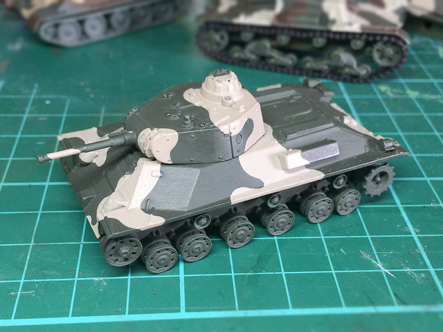
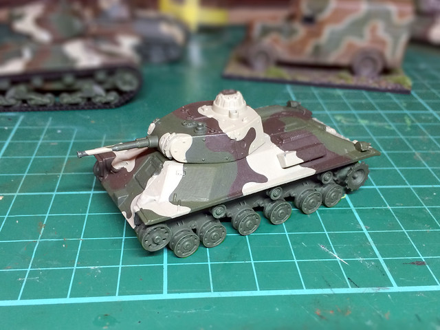
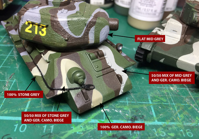
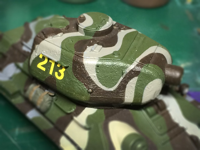
After the base of dark green I applied the 'Finish Grey', or rather, I added my interpretation of it - a light beige-grey (50/50 mix of Valejo's Stone Grey and German Camo Biege).


I'm afraid I had to be a little creative with the camo pattern as there are only two period photographs of this particular tank, and they are - sadly - in black and white. So, I've used my artistic licence.

I read that the Finn's applied the Grey to a 50% proportion of tehoverall camo, with the Green and Brown making up 25% each. But, from what I have seen - in reference photos - the application of paint and it's pattern was a bit more ad-hoc than that.

The Finn's variety of tanks all seem to have displayed a variety of patterns - some with thin stripes of the 3-colour scheme, some with large patches. There doesn't seem to have been a a printed guide to scheme application - as there was in the British and US armies - so I am guessing there was some latitude from unit to unit.


I am quite pleased with my brown mix, but I still think my 'Moss Green' was lacking a little oomph. So I modulated my dark green with a quick, thin wash of Vallajo Air's Russian Green. This was just enough to give the green a bit of luster in the right light.

Tuesday, 22 December 2015

Finished with Finnish camo?

This has been a struggle, and I know you will think I have grossly belaboured the point, but getting the Finnish 3-Colour camouflage scheme right had been something of an obsession. And while I was somewhat satisfied (or is the word 'resigned') to my last work on the scheme - where I think I got close to the actual colour mix of the scheme - I received an email from Andreas Lärka (of Andreaslarka.net fame).

Andreas very kindly got back in touch with me - after having looked at my blog - with the following suggestion for the 3-Colour camo using Vallejo paints...

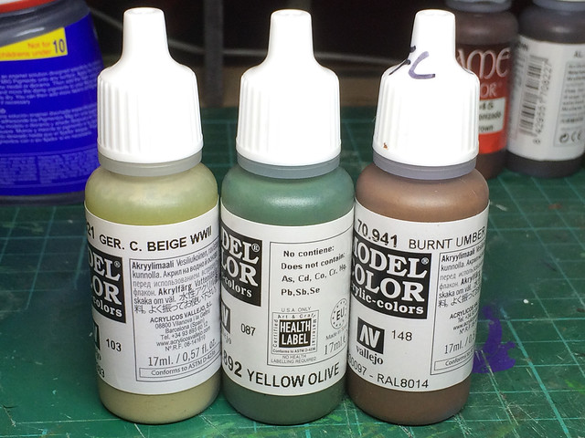
Moss green = 892 Yellow Olive
Sand Brown = 941 Burnt Umber
Light Grey = 821 German Camouflage Beige

Now, at first, my heart dropped as I have spent an inordinate amount of experimentation to get 'my mix' right. I dreaded this new recipe as I imagined it would brush away (excuse the pun) all my hours of work. So, it was with a heavy heart that I trudged down to my local hobby shop and duly bought Andreas's paint combo...


Well, in fact, I only had to buy two of the paints as - a spot of good news - was that I was already using Vallejo's Burnt Umber in my mix for the Finnish 'Sand Brown'. Quite pleased with myself about that, as it's nice to know I was at least on the right track with one out of the three (though I went a shade darker by adding some Vallejo 822 German Camo Black Brown).

There was more good news when I got how and tried out some test swatches. The 'Yellow Olive' was almost exactly the same as my mix for the 'Moss Green' I couldn't believe it! That not only means that my colour mix is confirmed as the correct shade of green, but it also means I can use one bottle instead of my tricky mix of three bottles.


So, only the Finnish Grey - and here's where my luck run out...

Andreas suggestion for the grey was a pronounced beige, in line with the sand colour that many modellers and model manufacturers had been using but that I thought was inaccurate...Drat!

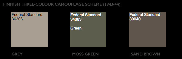
And to rub my nose in it, I just happened to be re-reading some books on the Finnish War and for a reference to their camo colour that I must have missed before. In Osprey's 'Tanks of Hitler's Easter Allies 1941-45' [New Vanguard #199, page 38] I found a note on the colours in the form of an paint standard called 'Federal Standard': Grey (~FS36306), Moss Green (~FS 34083), and Sand Brown (~FS 30040).


Double drat! It's looking more likely that the beige I thought was a misinterpretation, due to weathering and age, may have actually been the official Finnish 'Grey' after all. But I *still* think a word of mitigation is warranted, because if you then look at the illustration that accompanies this colour notation in the Osprey book you will find a nice picture of a Finnish 'Sturmi' (StuG III Ausg. G) with a suspiciously grey looking grey in its camo! (And, indeed, they go on to repeat this shade of sea-grey in the other two examples of Finnish armour they include in this section of the book!)

If, by now, you feel somewhat confused...Join the club!

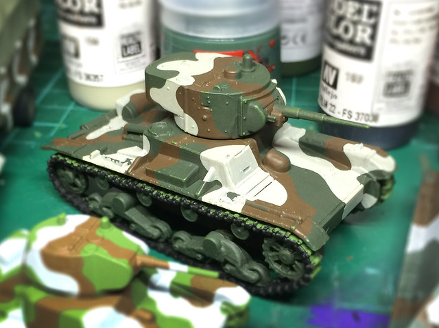
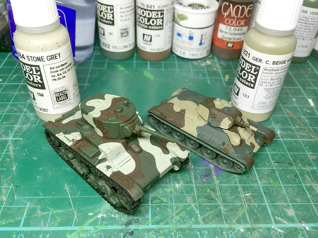
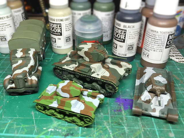
But, I decided to give the benefit of the doubt and I repainted my 1/100 test T-34 with the beige so I could compare it to my more grey oatmeal colour I used on my T-26...


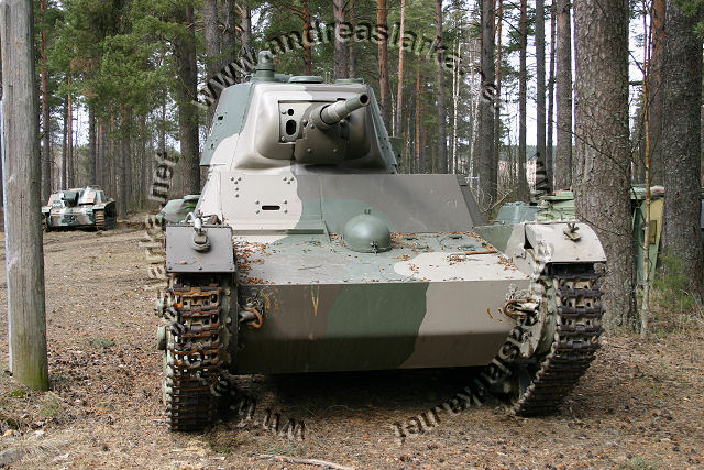
Whoa! That's very beige, in fact, I would say it's fawn or light-tan. On the left, you can see my interpretation, which is a far lighter oatmeal grey (Vallejo's 'Stone Grey'). Now let's compare them to one of Andreas's photo references...
Copyright: Anreaslarka.net - no use without permission.
Now, I think my oatmeal is closer to the Finnish Grey in this photo than the German Camouflage Beige is. In fact, I'd say it's almost exactly halfway between my oatmeal and the beige. So...You guessed it...It's back to the palette again...


And finally...The Scale Effect
How can a colour change? That's what I have been asking myself while trying to get this Finnish Grey right. Of course, there is the modifier of weathering and age - colours fade - but I was also reminded of an optical effect which modellers know as the 'scale effect'.

Long story short colours fade with distance - so while my Finish reference photos show a beige/cream grey close up the further away the photo the lighter and less cream and more grey that colour becomes. I became acutely aware of this when I looked closely at the colour in the bottle - in the bottle Vallejo's 'Stone Grey' looks spot on the grey/beige that you can see in Andreas's T-26 photo (above), but paint it out and then look at the result from 2 feet away and suddenly it become too light!

"...a model painted with the correct color scheme can still look artificial, if this scale effect isn’t taken into consideration. The best guideline is this: colors should appear more muted and less intense. With dark colors, a few drops of white can be mixed in. This softens black, for example. With light colors, a few drops of light grey can be mixed in." Painting Your Model For The Greatest Realism by Art Braunschweiger.

The further away I get from my test models the 'more correct' the lighter colours look in intensity when compared to the longer range photo reference I have. But this is all a very dark art, and as Michael Benolkin warns in his article called Color Scale Effects in Modeling, on the Cybermodeler web site:

"There is no one right answer to your modeling preferences. Some modelers don't worry about scale effect, some do. Different modelers apply precise degrees of scale effect to their work, others simply paint straight out of the bottle."

Phew! So, in the end, the decision is mine. At some point, I have to get off the fence and make a firm decision about 'Finnish Grey'. As a graphic designer, I am probably more worried about colour theory than most and apt to fret over it more than is healthy.

And so, here's my final (positively final) decision on the Finnish Grey...


Here my long suffering test Finnish T-34/85 (I hate to say how many coats of paint this has had now) has my ultimate 'grey' mix. It's 2/3rds Vallejo Ger. C. Beige mixed with 1 third Medium Sea Grey. It has the creamy hint, but not the tannish beige of Ger. C. Beige on its own, and yet - from a distance - it has a touch of flat grey.

I must have it sort of right now because when you look at the model arms length you find yourself wondering whether it's beige or whether it's grey! I'd call that a success.

And so, that's my three Finnish colours done! (Honest...Really...No, really really!)

[If I get another email from Andreas I'll shoot myself!] ;)

...Seriously, a great big thank you to Andreas Lärka.

Postcript...I've just had an email from Andreas! BANG! ;)
Wednesday, 16 December 2015

Finnish T-26 m1933 - Part 3

After a bit of umming and ahhing, I decided how I would equip my Finnish T-26 companies (2 x light tank units of 3 T-26s each). The Rapid Fire rules specify the inclusion of the Finn's T-26E variant, but I can't find a model that reflects that accurately. So I have settled on a unit configeration of two of the cheap Pegasus T-26 m1933s plus one very nice Mirage T-26 m 1939.

Anyway, back to the kit. I'm starting by doing a 'pilot' example of the Pegasus m1939, but noticed a couple of niggles (nothing big).


The tracks of the Pegasus model stick out a bit - they are supposed to be flush with the mudguards. So I ended up sanding down the stubby axels so that the tracks sat closer to the chassis. Also, the 45mm gun is a little bit weedy looking (and a bit bent). So, in this case, I am going to look and see if I can find a replacement metal gun on the internet.

I primed (or base painted really) the tank with a bright green - Humbrol's Grass Green - because I thought it might give a nice glow to the top coat which I am doing in my 'Finnish green' mix (a darker green). Be nice to see what effect this has.


I was brave and experimented with a 'washy' application of the dark green! It's a streaky in places so you can see the bright green undercoat in places. This might be quite nice as it gives a nice variation in tone (I suppose were this a 1/35 scale kit I would have created this effect a little more smoothly by pre-shading with an airbrush).

Does it work? Well, my preference I think is for a flat dark green though I know other might prefer the hint of the brighter green as it conforms to the idea of the Finnish designation of the colour as being 'Moss Green'. Here's a reliable reference photo from the excellent Andreaslarka.net...

Finnish T-26 m1939 on display at the Finnish Armour Museum. This clearly
shows the green as being the dark 'blue-green'. Picture source and copyright:
© Copyright by Andreas Lärka, Finland. Andreaslarka.net
I'm going to see how this runs when I apply the other camo colours - I can always return to my flatter dark green for the rest of my T-26s (and subsequent Finnish armour) if it doesn't 'wash'! ;)
Note the 'creamier' tone of the Finnish 'grey' on this tank. This is the warmer tone of grey I have been trying to reproduce by adding Vallejo's 'Stone Grey' to my mix. But notice how it is nowhere near the sand colour that some model manufacturers use in their painting instructions. (My recipe for my Finnish 'grey' is now about a 60/40 of Stone Grey to Pale Blue Grey paint.)
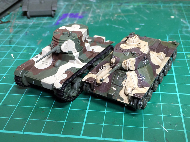
I'm quite pleased with it.

The results of my recent painting experiments, culminating to my 1/72 T-26.
My 'final' Finnish camo recipe..? So close, but not quite there yet.
I'm a little less pleased that my rough handling of the model during painting has rubbed off some of the dark green. But, then again, I do finish my painting process with a touching up session. Still, I'll have to try and be more careful.

As to the brown, I'm a tone too light and too red - I need a more flat-chocolate brown mix (I will tweak it to be a smidgen darker on my T-26 production run). In fact, I was greatly heartened by an email from Andreas from Andreas.net who said:

Quote: "The Finnish WWII camo was quite dark, so that is a thing to consider (even with the scale-effect)."

This reinforces my belief about the green and the brown. And while the grey is still quite light it will be calmed down a bit once I weather the model.

I continue to be annoyed with the weedy gun though...I will have to do something about that!

Credit: I would like to thank Andreas Lärka - of the excellent Andreaslarka.net fame - who has offered me his assistance (and importantly larger copies of his reference photos) which have helped me identify the colour hues that I am after.