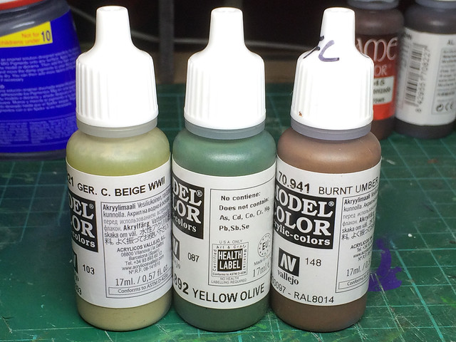
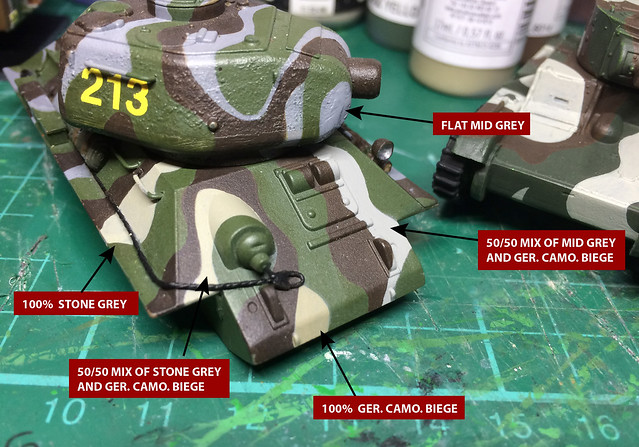
Andreas very kindly got back in touch with me - after having looked at my blog - with the following suggestion for the 3-Colour camo using Vallejo paints...
Moss green = 892 Yellow Olive
Sand Brown = 941 Burnt Umber
Light Grey = 821 German Camouflage Beige
Now, at first, my heart dropped as I have spent an inordinate amount of experimentation to get 'my mix' right. I dreaded this new recipe as I imagined it would brush away (excuse the pun) all my hours of work. So, it was with a heavy heart that I trudged down to my local hobby shop and duly bought Andreas's paint combo...
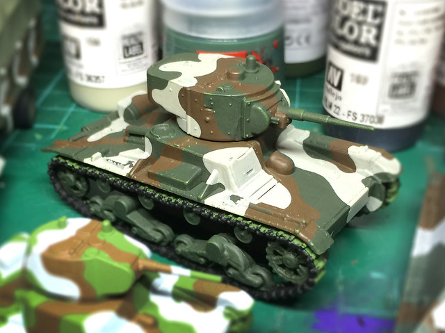
Well, in fact, I only had to buy two of the paints as - a spot of good news - was that I was already using Vallejo's Burnt Umber in my mix for the Finnish 'Sand Brown'. Quite pleased with myself about that, as it's nice to know I was at least on the right track with one out of the three (though I went a shade darker by adding some Vallejo 822 German Camo Black Brown).
There was more good news when I got how and tried out some test swatches. The 'Yellow Olive' was almost exactly the same as my mix for the 'Moss Green' I couldn't believe it! That not only means that my colour mix is confirmed as the correct shade of green, but it also means I can use one bottle instead of my tricky mix of three bottles.
So, only the Finnish Grey - and here's where my luck run out...
Andreas suggestion for the grey was a pronounced beige, in line with the sand colour that many modellers and model manufacturers had been using but that I thought was inaccurate...Drat!
And to rub my nose in it, I just happened to be re-reading some books on the Finnish War and for a reference to their camo colour that I must have missed before. In Osprey's 'Tanks of Hitler's Easter Allies 1941-45' [New Vanguard #199, page 38] I found a note on the colours in the form of an paint standard called 'Federal Standard': Grey (~FS36306), Moss Green (~FS 34083), and Sand Brown (~FS 30040).
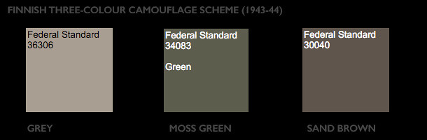
Double drat! It's looking more likely that the beige I thought was a misinterpretation, due to weathering and age, may have actually been the official Finnish 'Grey' after all. But I *still* think a word of mitigation is warranted, because if you then look at the illustration that accompanies this colour notation in the Osprey book you will find a nice picture of a Finnish 'Sturmi' (StuG III Ausg. G) with a suspiciously grey looking grey in its camo! (And, indeed, they go on to repeat this shade of sea-grey in the other two examples of Finnish armour they include in this section of the book!)
If, by now, you feel somewhat confused...Join the club!
But, I decided to give the benefit of the doubt and I repainted my 1/100 test T-34 with the beige so I could compare it to my more grey oatmeal colour I used on my T-26...
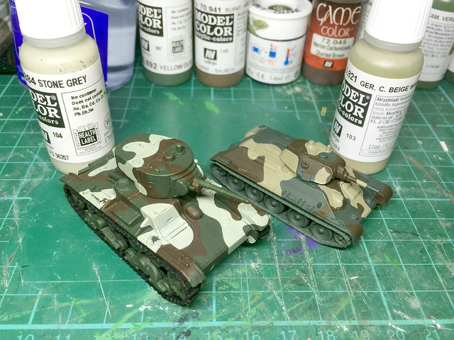
Whoa! That's very beige, in fact, I would say it's fawn or light-tan. On the left, you can see my interpretation, which is a far lighter oatmeal grey (Vallejo's 'Stone Grey'). Now let's compare them to one of Andreas's photo references...
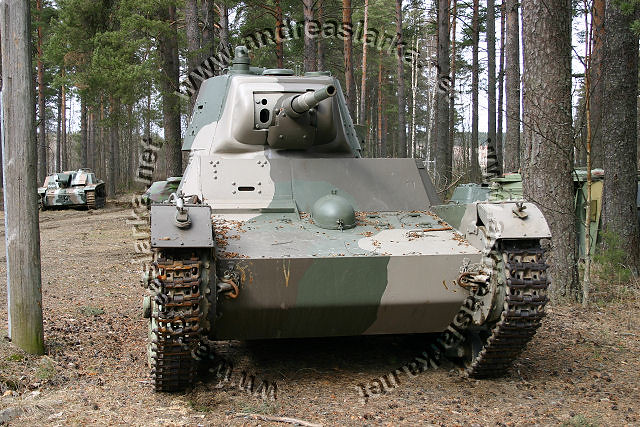 |
| Copyright: Anreaslarka.net - no use without permission. |
And finally...The Scale Effect
How can a colour change? That's what I have been asking myself while trying to get this Finnish Grey right. Of course, there is the modifier of weathering and age - colours fade - but I was also reminded of an optical effect which modellers know as the 'scale effect'.
Long story short colours fade with distance - so while my Finish reference photos show a beige/cream grey close up the further away the photo the lighter and less cream and more grey that colour becomes. I became acutely aware of this when I looked closely at the colour in the bottle - in the bottle Vallejo's 'Stone Grey' looks spot on the grey/beige that you can see in Andreas's T-26 photo (above), but paint it out and then look at the result from 2 feet away and suddenly it become too light!
"...a model painted with the correct color scheme can still look artificial, if this scale effect isn’t taken into consideration. The best guideline is this: colors should appear more muted and less intense. With dark colors, a few drops of white can be mixed in. This softens black, for example. With light colors, a few drops of light grey can be mixed in." Painting Your Model For The Greatest Realism by Art Braunschweiger.
The further away I get from my test models the 'more correct' the lighter colours look in intensity when compared to the longer range photo reference I have. But this is all a very dark art, and as Michael Benolkin warns in his article called Color Scale Effects in Modeling, on the Cybermodeler web site:
"There is no one right answer to your modeling preferences. Some modelers don't worry about scale effect, some do. Different modelers apply precise degrees of scale effect to their work, others simply paint straight out of the bottle."
Phew! So, in the end, the decision is mine. At some point, I have to get off the fence and make a firm decision about 'Finnish Grey'. As a graphic designer, I am probably more worried about colour theory than most and apt to fret over it more than is healthy.
And so, here's my final (positively final) decision on the Finnish Grey...
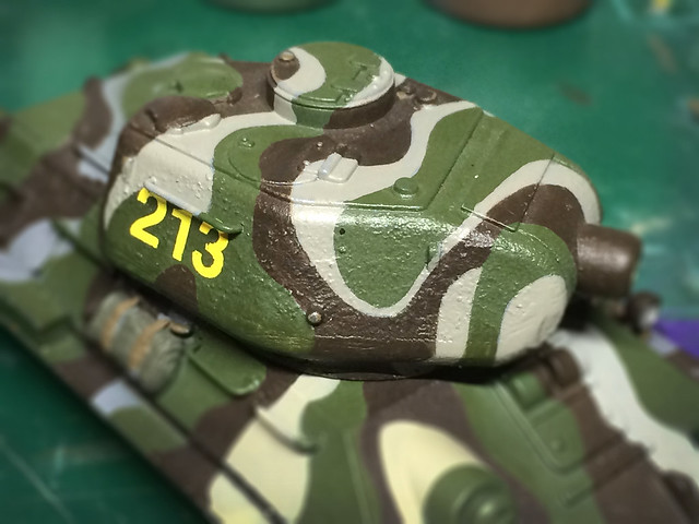
Here my long suffering test Finnish T-34/85 (I hate to say how many coats of paint this has had now) has my ultimate 'grey' mix. It's 2/3rds Vallejo Ger. C. Beige mixed with 1 third Medium Sea Grey. It has the creamy hint, but not the tannish beige of Ger. C. Beige on its own, and yet - from a distance - it has a touch of flat grey.
I must have it sort of right now because when you look at the model arms length you find yourself wondering whether it's beige or whether it's grey! I'd call that a success.
And so, that's my three Finnish colours done! (Honest...Really...No, really really!)
[If I get another email from Andreas I'll shoot myself!] ;)
...Seriously, a great big thank you to Andreas Lärka.
Postcript...I've just had an email from Andreas! BANG! ;)
No comments:
Post a Comment