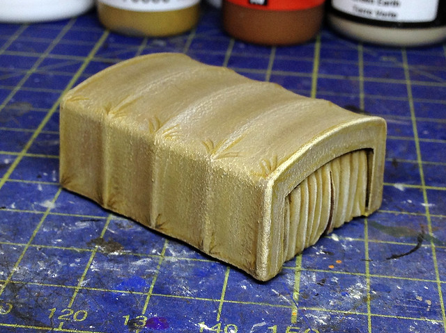
Now I had a bit of trouble here, although I have done a few canvas tilt covers now they have all been light 'khaki' coloured which lends itself to my 'chalk' technique. These German trucks have darker grey/olive drab canvas cover.
Now I should begin by saying that I have found that airbrushing doesn't work for me with canvas covers. Maybe I don't have a steady hand, or maybe my airbrush isn't fine enough, but for-whatever reason I cannot seem to get the same subtle effects that other modellers seem to be able to get using an airbrush...
 |
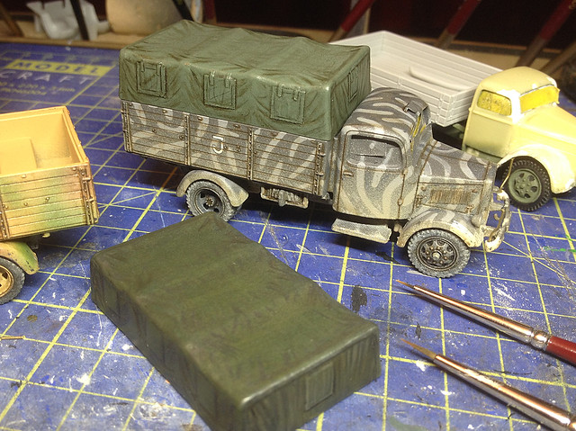
| My previous effort - ZiS-6 - at a canvas cover using Conte crayons. I found it my easier to do a lighter coloured canvas colour than I am doing my current darker colour one. The contrast of colours seems to suit a lighter tone. |
So, the process I've adopted is as follows (more or less)...
1. After base coating the canvas with a mid-colour version of my target colour I begin to work into the shadow patches using a dark wash. I also outline any features - like the tilt 'window flaps'...
This looks a bit 'cartoony' at the moment as it just two colours - the mid-green and the shadow colours. I then give this a quick spray of satin varnish to protect this layer before I start the high-lighting with my Conté crayons and pencils - this is done so I can easily wipe off any crayon that I'm not happy with.
2. I begin to loosely sketch on lines of high-light on the crest of any folds in the 'canvas'. Just gently drag your crayon over the raised surfaces in the canvas in a similar way to dry-brushing - which is another way I could have done this, by the way. But the difference between my chalk technique and dry brushing is what happens next...
 |
| Note: The canvas looks darker because of my lighting - it's actually the same mid-green as the picture above. |
You may find that the effect is too subtle and a lot of the chalk disappears while blending. Don't worry, just keep re-applying in layers until you achieve the effect you want (I had to go around the canvas two or three times, repeating the application of the chalk until it reached a level of high-light that I wanted).
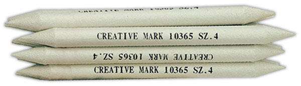 |
| To blend pastels or Conte crayons or chalks I use a paper based blending 'stump'. A paper-based 'pencil' which can be sharpened to a point for fine blending and also to clean the point between colours. |
This also has the effect of 'flattening out' the rather chalky texture and graininess of the blending as well as protecting the chalk while you add more shadow wash or work into the medium tones.
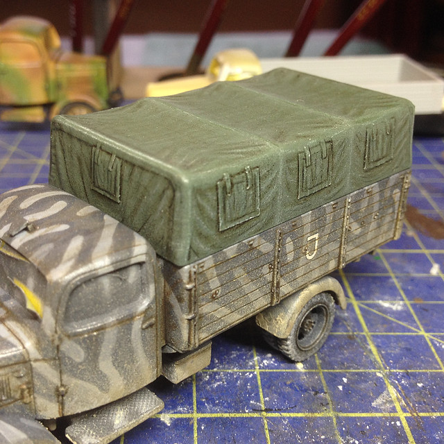
I'm probably less happy with the effect so far on this one than I was with my previous khaki coloured canvas covers. Maybe it's because I overdid the wash outlining which makes the 'window flaps' look drawn on. I shall have to use a lighter wash for this in future.
It's a sort of 'Pontoon' ('Black Jack') situation really - as a lot of weathering is - and at this point I choose to 'stick'. Yes I could fiddle around a bit more gambling on a better effect, but I could also 'go bust' and spoil what I already have.
Next: Last stage - the windscreens.
I think they came out very nicely, especially at the scale you are working.
ReplyDelete