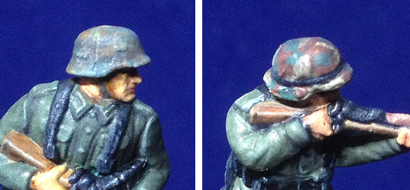
It's pretty much a production line job, applying one colour at a time across the figures, working 'inside out'. I start with the flesh - Vallejo's 955 Flat Flesh - and then move on to the tunics, then equipment and so on...
On the matter of what constitutes 'Field Grey' I have decided to be flexible and create what I feel was probably a late war scenario in the Wehrmacht Heer (army) where uniform quality was 'variable'. I wish to give the impression of a decline in supplies with a somewhat rag-tag look to my soldiers.
Obviously, while uniform quality probably did vary at this point in the war uniforms were most likely issued from supplies in batches, so units probably had uniforms of similar colour and quality - but this would no doubt vary from unit to unit as they received different batches from different manufacturing factories. So my intention to vary colours quite radically within one unit is a bit of exaggeration for effect.
 |
| The base coats applied, pre-shading. |
I began with laying down a tunic or trouser colour of the lightest shade of my target colour, then when that was dry I gave it a good going over with a wash of the 'out the bottle' target colour itself (to create some subtle shading and modulate the overall colour back toward a 'medium' shade). Then I worked on the shadows and deep creases with a darkened shade of the target colour. And finally, I added some highlight details using a near white version of the target colour.
One thing I found when doing my test figures was that it was best to slightly over-exaggerated effects. Subtle highlighting, for example, was lost somewhat when I vanish coated the figures. Slightly exaggerated highlights remained visible, though a little subdued, after the varnish coat.
You sort of get a feel for how much to over-exaggerate colours so that - hopefully - they turn out the correct target colour at the end of the process. But that's the beauty about doing test figures first.
It's all very interesting and I'm really enjoying the learning experience - but you really get to appreciate it when you see a very well painted figure...Boy! Those experienced guys really put a lot of practise in!
Helmet camo painting...For beginners (like me)!
As these are very early days as far as figure painting is concerned I am trying to keep everything pretty simple. Painting realistic camouflage patterns on Braille Scale soldiers is probably one of the more complicated techniques to learn (along with realistic skin tones) and I would have been happier to have avoided doing camo at this point - unfortunately my PSC Germans nearly all have camo helmet covers. Still, could have been worse and I guess it's a nice introduction to this subject.
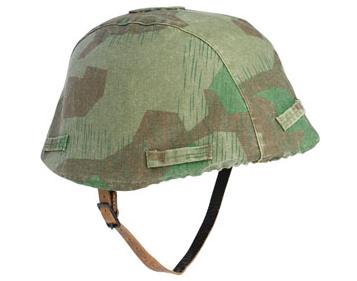
I was surprised to discover that the lovely 'Splinter' pattern camo that was used by the Germans was not a late war innovation and actually stemmed from the 1930s!
Buntfarbenaufdruck 31 or, more commonly, Splittertarn (splinter-pattern) was first printed on the newly designed and issued triangular tent/poncho called the dreieckszeltbahn ("3-corner tent"). On the PSC Germans this 'ponch'-come-tent is visible as part of the equipment carried on their backs, and of course the camo is also displayed on their helmet covers.
For more precise information regarding the nature, position and colour of German
army equipment and how it was carried refer to this excellent site: www.mp44.nl/
army equipment and how it was carried refer to this excellent site: www.mp44.nl/
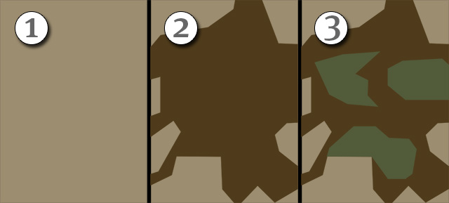
Weathering and shading aside the actual paint process here - and on the rolled up poncho - was pretty simple thanks to Splittertarn's hard-edged, solid coloured geometric design. I simplified the pattern somewhat (for scale) and followed this procedure...
Now a couple of points regarding authenticity. First of all, from all the various reference photos I have looked at of the actual helmet cover there is some variation in the scale (coverage) of the pattern and also some colour drift - sometimes the base colour is khaki-buff and at other times (as with the example above) it has a slight green hue to it. But, secondly, I also didn't try to replicate the very small and fine green 'dash' pattern which was overprinted onto the basic geometric design of the camo simply because at this scale I doubt it would be seen.
(Kamoflague.net in fact described the 'khaki' base colour as '...light field grey or tan background'.)
As with the basic uniform I do intend to create some colour variations within my squad to reflect wear and the position of the camo on the cover (it was not always the same depending where the original cloth was cut from the roll).
NEXT: Fine details, then the shading washes.


No comments:
Post a Comment