To begin with I started my German figure in exactly the same way as I had my Strelet's Finns, but I had already primed the German with a mid-grey colour.
I haven't really decided what makes a good colour for a primer base as yet - some people say white and some prefer black (for speed painting), so I thought grey was a good compromise!
Anyhoo - first problem. Like most people I know that German infantry wore uniforms of Field Grey...That would be a sort of mid-grey them wouldn't it? Er, after checking out a couple of Osprey reference books I discovered that Field Grey wasn't as grey as I imagined!
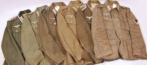 |
| Mid-grey, greeny-grey, browny-grey, buffy-grey, more grey, grey...What the flip? Afraid I don't know the original source of this photo but it regularly appears on forum threads about German Field Grey. |
Osprey reference: Men-At-Arms 'The German Army 1939-45 (5) - Western Front 1943-45'
Plastic Soldier Company recommend Vellejo's 920 German Uniform and 886 Green Grey for their figures, but I found 920 too green and 886 too dark...
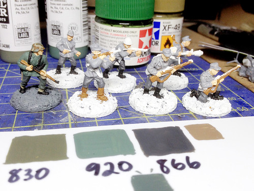 |
| Painting my German (far left) along side my Finns, below are my Vallejo paint swatches, I tried 920 for the jacket first but thought it too green. |
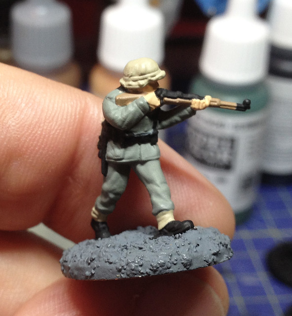
 I tried 920 German Uniform at first but had to repaint it with a grey wash as it was far too green for my liking.
Left: My first base coating attempt, the jacket is too green but I like the grey of the trousers, so I later gave the jacket a light wash of the 866 Grey Green to darken it a bit.
I realise that a lot of reference does mention that German Field Grey did have a green tinge to it, but at this small scale I imagined that would be quite difficult to see unless one exaggerated this for effect (which some modellers actually seem to have done). My preference was based on all the old war films I used to watch, Field Grey was mid-grey as far as I was concerned!
So it was back to the drawing board as I began to shade my first attempt at a Late War German. I began by toning down everything so it looked a bit 'war weary', but I did find that the problem was that I had already painted him a medium colour, so in darkening it I was risking the finished model turning out too dark...
Not too bad, but as I suspected probably a bit too dark - dark enough that the colours are muddy and indistinguishable - so I figured that really you do want to exaggerate and over-lighten the main colors so you can get the sense of a distinctive German uniform (and be able to distinguish it on a war game table from other armies). To his end I decided to have a second go - but this time I would start with lighter base colours...
The theory here is when I start to add the shading wash the overall effect will be to darken the lightened base colour back to the medium target colour. So, my lightened 830 Field Grey when shaded should approximate 830 out of the bottle (if I got the mix right)...
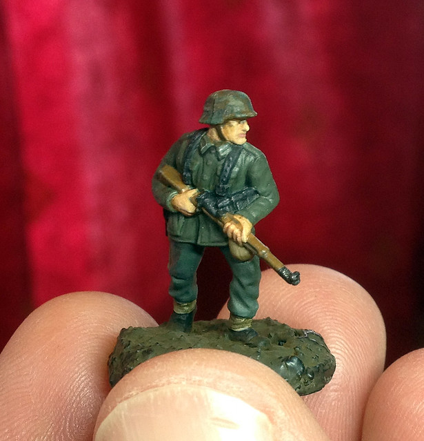
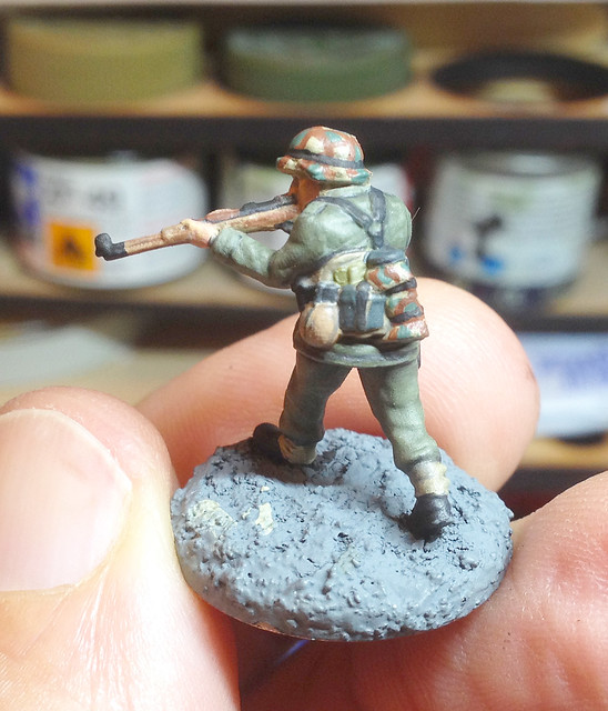
It seemed to work! On the left - above - you have my first attempt with the 'out the bottle' Vallejo 830 Field Grey tunic, and on the right my shaded second attempt which started too light but then was 'modulated' back to near 830 again, but with shading!
I'm happier with the second attempt for wargaming purposes. Historically, I *think* my first attempt was closer (though maybe a tad too dark) to the look of WWII German soldiers, but was too muddy and indistinct to act as an easily recognisable marker on the tabletop for a game. My second attempt is perhaps a little exaggerated and too light but is a distinctive colour that would mark it out as German compared to other soldiers on the tabletop.
It's a matter of preference and I won't stop experimenting with shades as I go on the paint the remainder of my Bolt ACtion German force. Bearing in mind the reference photo of the real German tunics I included above I have some latitude for a variation in shades. I think the ideal Field Grey for gaming is probably exactly halfway between the two test samples I have painted.


Brilliant painting skills. How about a tutorial on the camo??
ReplyDeleteCheers! That's very nice of you. A camo tutorial sounds fun - I do have a sniper that has the full German camo smock. But so far I have had the comparatively easy camo to do - the 1932 Splinter pattern. I wouldn't like to have had to do the 'SS' Oakleaf pattern! Oh boy! ;)
Delete